Life After the Jam
Hello everyone, I guess it's time for my first devlog. It's been a long time since GMTK Game Jam has ended, and I've been pretty much inactive here. Doesn't mean I've given up on Lost Signal though.
During the jam, I've got a lot of feedback, and I'm really thankful for that. There were some issues pointed out by the players, and I'm definitely going to address it (in addition to other things I want to improve).
Now, to the updates I've got so far (these are not uploaded yet).
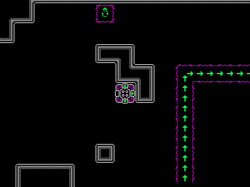
First, I decided to re-do the graphics. I chose to stick with the original art style but make it more polished. I've played Machines & Modules & Motion, a game that had only 3 colors (black, white, orange) in the palette, and I found it really stylish. So, I changed my colors to black, white, green and magenta. In my opinion, the last two make pretty good contrast while staying colorblind-friendly (at least according to a website that simulates different kinds of CVD).
To help bring the player's attention to important parts (e.g. exit tile or conveyors), I kept the walls plain white while using colors on these active tiles. The information-carrying parts are green because that color appears to be brighter for the colorblind.

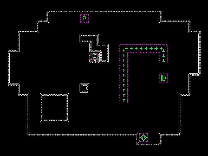
Second, I tried to tackle one issue pointed out in the comments: the (in)ability to see the full level before pressing any buttons. The solution I've come up with so far consists of two parts: the zoom out feature (pressing a key to view the whole level), and better camera positioning (e.g. if the level fits the screen, then the camera is fixed to it, eliminating the need to zoom out completely). Pixel art gets janky when scaled though, but I hope it still gets the job done.

Finally, as you could see in the screenshots, I added more reset tiles: now they can not only reset all directions, but also reset specific ones (as shown on the tile) while leaving the rest as is. I hope it will be easier to understand in the game instead of this devlog, and I believe it will allow to design more interesting levels.
I also tweaked some internals to simplify the development process and tried to tidy up the code.
There are more planned features (like two more kinds of active tiles) and improvements (like UI redesign, control and sound settings) so I've got a long way to go.
Thanks for reading!
Lost Signal
A game about trying to escape while you are getting more out of control with each keystroke
| Status | Prototype |
| Author | RedTeapot |
| Genre | Puzzle |
| Tags | 2D, Game Maker's Toolkit Jam, Singleplayer |
| Languages | English |
Leave a comment
Log in with itch.io to leave a comment.